2017 is the Year of Fire Rooster according to Chinese Horoscope, the Year of new skills in Estonia and the Year of green color according to Pantone.
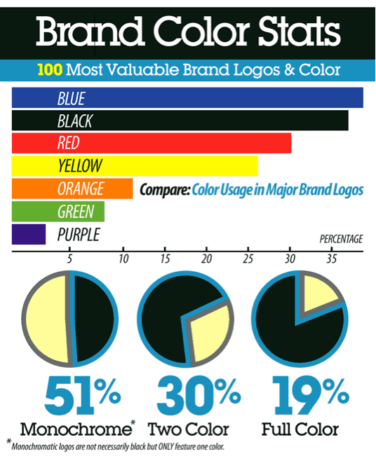
No wonder that everyone who wants to create new logos for their companies pays a special attention to green as a basic color for the logo. However, according to the statistics, green is only the sixth popular color in major logo designs. It’s well-known that if the color is popular among logo designers it may only mean that this color is effective and has influenced people in a necessary way. Let’s find out which colors are successfully used in logo design creation and perhaps it will help you decide which color to use to design your future logo.
Blue is everywhere
Blue logos are extremely popular because they fulfil their main destination: if designed properly, they show their reliability and that the companies they serve for are worth being trusted. Blue color is associated with intelligence, communication and trust. Now, take a look at the most popular brands that have decided to use blue on their logos: Facebook, Twitter, PayPal, Intel etc. These brands combine three main traits that blue color represents.
Nevertheless, blue color doesn’t do magic, that’s why there are examples of its disastrous usage in logo designs. For example, Arlington Pediatric Center has chosen blue shades to show a parent with a child, stressing out the devotion and security. However, the designer of this logo had perhaps something different in his mind because the picture can be explained in a different way.
Back in Black
It isn’t only one of the most popular AC/DC song but also the latest trend in logo designs. Black color symbolizes security, sophistication and smart style. Black color absorbs everything and that’s why gets easily highlighted among the rest of colors. That’s why the most expensive and refined brands in the world picked black for their logos. Luxurity is the best companion of this color and it goes without saying that it is included into such brands”awareness.
There still can be some cases when black logos were performed in a terrible way. Even though they seem impossible to get spoiled, some logo designers succeeded in this business. Thus, the Hershey Company overused this color and proved that sometimes even black can be too much. The logo after its upgrading became ridiculous because a candy on it turned into not exactly another candy. Soon afterwards the company has stopped using this logo but on their website one can still notice its “remains”.
Not just a color but a state of mind
Courage, strength, passion, energy and excitement. These adjectives can describe only one color which is the third popular in logo design: red. Somebody said that red isn’t just a regular color but a state of mind. Indeed, those who choose red for their logos are extremely brave, think in a different way and want to gain lots of attention. Every existing business branch has some representatives who have chosen red for their logo design. Two major spheres are automobile and food industry probably because red is supposed to awaken your appetite and makes you move faster.
When choosing red for your logo you need to be extremely careful. Red demands attention and if you fail in creating your logo it will be much more visible than in all the other cases. For instance, one of Chinese companies decided to be overcreative. Unfortunately, they didn’t experience any lack of creativity (in this case it would help a lot). On the contrary, their creativity lead to designing a logo that cannot be explained: it should first be seen, then it would never be forgotten.
How wonderful is yellow! It stands for the sun. – Vincent Van Gogh
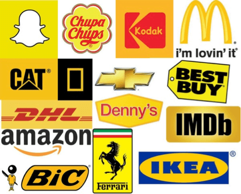
Yellow was Van Gogh’s favourite color and all of his best masterpieces are inspired by yellow shades. This color is responsible for the warmest emotions you may ever get like optimism, self-esteem and confidence. It is associated with friendliness and creativity that’s why logos with yellow as the main component are literally sunny and awake the strongest positive feelings in you. Amazon, Shell, Kodak etc. raise your spirit and inspire you with warmth and trust. In terms of psychology, yellow is believed to be the strongest color.

Unfortunately, even such a beautiful color with strong characteristics can be spoiled when used by a wrong person. A-Style company decided to entertain its visitors and presented the logo that could do nothing but make people laugh. Perhaps, it was too creative or aimed at a slightly different audience because otherwise it’s simply dull. And, frankly speaking, a bit funny. The comments in the internet suggested the company changing its name in order to catch up with such logo and become not exactly A-Style.
Orange is the happiest color. – Frank Sinatra
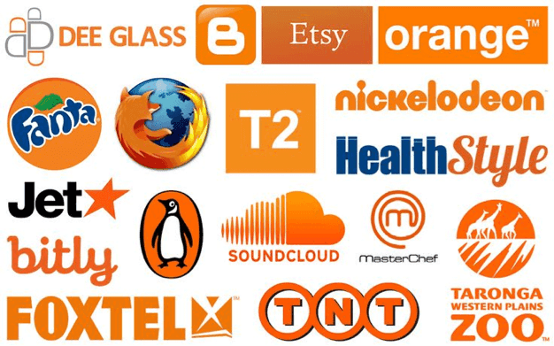
If there is some truly inspirational music, it would be Frank Sinatra’s songs. Frank Sinatra himself adored orange and considered it to be truly inspiring. Orange is associated with lots of different things but first and foremost with comfort, abundance, passion and fun. Orange is the most pleasant color and it’s used by a lot of companies in their logos. Thus, merriment and movement surround this color and it gets easy to promote logos this way. Etsy, Fanta and Netflix are only several logo examples that promote youth and excitement.

Logos with this color look thriving but only in case when you want them to look like that. Otherwise, you get a logo which concept is not easy to understand. Jeffrey Zeldman, a famous US web designer, said that the logo without a concept isn’t a logo, it’s a decoration. If you look at the following logo, you will see how hideous this decoration can be.
Greenery-greenery-greenery-green
Green is the newest trend in logo design. It’s loved both by women and men for being a color of youth and growth. It’s calm and develops trust. That’s why it’s used by lots of brands like Android and Eco and fits into the concept they create.
